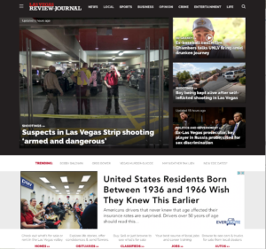
 The Las Vegas Review-Journal delivered quite a surprise when it rolled out a brand new nameplate in April, according to a story in Editor & Publisher. Featuring a bold red and black Rockwell logotype font above an illustration of the iconic Las Vegas Strip, the fresh look provided readers with just a taste of the changes made to the paper’s print product and website.
“We wanted something that had a modern feel, better organization, more graphic displays, and essentially make the paper easier for our readers to navigate from front to back,” said editor-in-chief Keith Moyer. “The positive feedback so far tells us that we’ve achieved that.”
The Review-Journal has used SBS Financials since 2016.

